
Museum Check In App
This app will help people schedule museum visits and see what exhibitions are on display in a timely manner. Being able to see crowd levels before booking a visit and showing what artists are currently on display will make the user more informed when making their decision. The primary objective is to create an app that is simple and easy to use, while also providing users with the most relevant and up-to-date information about their favorite museums.

Project Overview

The problem:
Visitors need a way to book museum visits with ease, navigate through the gallery smoothly, and be informed with what current events are happening at the museum.
The goal:
-
Determine if users can complete core tasks within the prototype of the museum check in app.
-
Determine if the museum check in app is difficult to use.
-
Have an aesthetically pleasing user interface that is simple to use.
-
Let users see how crowed certain days are before booking a visit.
My role:
lead UX designer, UX researcher, UI designer
Responsibilities:
user research, wireframing, prototyping, Affinity Mapping, Customer Journey Map, User Flow, Problem Solution.
Understanding
The User
-
User research
-
Personas
-
Problem statements
-
User journey maps
User Research: summary
I conducted interviews created empathy maps, made competitive audits, and personas to understand the users I am designing for and their needs. A primary user group identified through research was working adults and students who have busy schedules.
When conducting research I revealed that time was not the only factor limiting users from museum visits. Other user problems included unfriendly user interfaces for mobile devices, and not knowing when certain events were happening.

Competitive Audit
To start, I conducted a competitive audit analysis in order to get ideas of what features were being offered in by other key competitors and what their values were.

Who are your key competitors?
Our key competitors are Eventbrite, LACMA, and American Museum of Natural History
LACMA and AMNH are both big art organizations that have exhibitions and events happening on a regular basis. Both organizations have a lot of foot traffic and sell a good amount of tickets.
Eventbrite is a global self-service ticketing platform for live experiences that allows anyone to create, share, find and attend events.


quality of competitors’ products
LACMA’s website is simple and incredibly easy to use. It allows users to see what is on display and what times certain exhibitions start. It is easy to navigate through certain pages to get what the user is looking for.
AMNH is very aesthetically pleasing and is also really easy to navigate through. This art organization makes it easy to get tickets for the certain shows one is looking for.
EventBright is very easy to use and has the option to use the search bar to find what one is looking for. If the user does not know what they are looking for there is the option to see what is popular and would be able to browse through that section.

Competitors’ strengths
Both AMNH and LACMA have an amazing web layout which is very user friendly and easy to use. AMNH does a great job of showing the user what is going to be on display and what times are available to see the exhibition.
Eventbrite Has an amazon search engine and allows the user to switch the language of the website to what is needed. They also have a help panel where you can click on the panel and get help when confused.
Competitors’ weaknesses
LACMA has an amazing web layout but the color theme and voice used on the website is very bland and does not evoke any type of excitement to visit the art museum. I think the website can do a better job of displaying their photos of the art on the webpage. LACMA also does not offer a mobile app
AMNH only weakness that I noticed was that you weren't allowed to change the language on the website. There was also not a help center anywhere located on the webpage.
Eventbrite gives maybe a little bit too much information and that makes choosing an event very hard to do so.

Gaps
-
No audio option for desktop or mobile app
-
Bland web set up
-
Dry language and can get repetitive
-
No map layout of where certain places are if trying to travel to the destination
-
Easy to get lost when trying to check out due to extensive amount of pop ups
Opportunities
-
Energade app with voice assistive technology
-
Show maps of how to get to location
-
Categorize art exhibitions by themes
User Research: Personas
I created Personas to better understand potential users and what pain points they might face when using the app.

"Let the world around you inspire the designs"
Problem statement:
Sam is a busy full time worker inspired by art who needs a way to navigate museums easily because she knows what type of artist she is looking for.
.png)
“Making my goals happen by being a go getter and meeting people in person ”

Problem statement:
Jay is a full time lawyer and family man who needs a simple way to see what days will be busy at the museum Because his two kids have claustrophobia.
User Journey Mapping
When making a user journey map, it allowed me to see how users might run into obstacles and highlight new pain points without having user bias.

User Research: Pain Points
Frustrating Interface
Time
1
Users want a fast efficient way to buy tickets on museum apps.
2
Many museum apps have a frustrating interface that is not user friendly.
Mapping
3
Visitors have a hard time navigating through museum buildings.
Crowds
4
Waiting in lines that could be avoided.

After research I discovered a few UX issues that block the user from getting what they need.
User Flow
I created a user flow that maps the user’s step by step process of how they would be able to Book an appointment for a museum visit.

Starting
the design
-
Paper wireframes
-
Digital wireframes
-
Low-fidelity prototype
-
Usability studies
Paper Wireframes
Taking the time to draft iterations of each screen of the app on paper ensured that the elements that made it to the digital wireframes would be well-suited to address the user pain points. For the home screen, I prioritized a quick and easy ordering process to help the users save time.

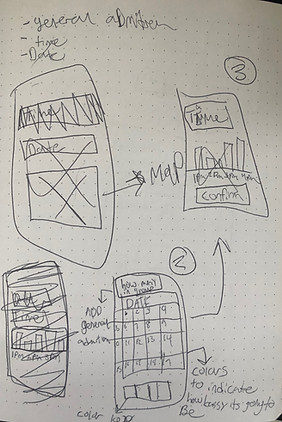


Digital Wireframes
Having a scrolling image bar will help the user visually see what is being showcased and interact with the app by swiping to the next image.
As the initial design phase continued, I made sure to base screen designs on feedback and findings from the user research.

The secondary flow will be placed just below the first user flow. Users will be able to explore what other events the museum will be hosting.

Digital Wireframes
The calendar will help visual learners navigate easier by seeing the date they select.
Easy navigation was a key user need to address in the designs in addition to equipping the app to work with assistive technologies.

The crowd key informs users what days have more foot traffic than others.
Low-Fidelity Prototype
The Low-Fidelity Prototype connected the primary user flow of scheduling a museum visit so the prototype could be used in a usability study with users.
view the Lo-Fi prototype

Usability study: findings
I conducted two rounds of usability studies. Finding from the first studies helped guide the designs from wireframes to mockups. The second study used a high fidelity prototype and revealed what aspects of the mockup needed refining.
First round findings

Second round findings

.
.
.
Affinity Diagram 1st Round
I enjoy using the Affinity mapping process to get all my information that I have gained from usability studies in one area. when grouping together the information, it makes it easier for me to know what the highest priority items to be completed are. P0, P1,

Affinity Diagram 2nd Round

Refining the Design
-
Mock ups
-
High-fidelity prototype
-
Accessibility
Mockups
Before usability study
After usability study
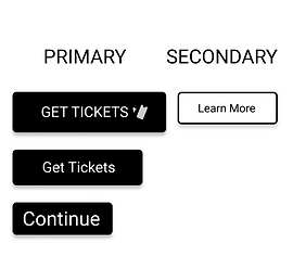
After usability studies, I added a larger top menu bar that has accessibility to every page in the app. I also revised the the primary CTA buttons to be more visible to users making the flow of the app smooth. Secondary buttons are ghost framed so it has a different look than the primary buttons. I added text underneath the icons so the user doesn't have to depend on just the logos themselves to figure out what the buttons are


Mockups
Before 2nd usability study
After 2nd usability study
The second usability study revealed frustration with the checkout flow as well as the button size. I made the arrow buttons to add tickets bigger so the user will not have trouble clicking them on the app. aI also added an exhibition strip at the top. The exhibition strip now allows the user to change museum visits in an easy, fast, and practical way. calendar now shows what days are busy by having a transparent hue behind each day to signify which days are busier than others.


Key Mockups

.png)

.png)

High-Fidelity Prototype
The final high fidelity prototype presented cleaner user flows for purchasing museum tickets and proceeding to check out. It also met user needs to see upcoming events, and easy navigational map for the layout of the museum. View prototype here
UI Kit

Colors

Fonts
Icons
Buttons

Navigation bars

Component set
Going Forward
-
Takeaways
-
Next steps
Accessibility Considerations

Takeaways
Impact:
The app “Museum Check In” really cares about their users. Implementing Inclusive design throughout the whole interface makes for a smooth navigation process that allows the users to get to point A to point B without any pain points.
One quote from pier feedback: “I loved using the menu page to navigate, it's an easy app to navigate through.”

What I learned:
During my case study I learned that almost all Museum organizations I would visit on my phone didn't offer phone friendly websites or Museum apps in general. I felt that since the Pandemic has happened museums need to create apps for their organizations. I created this Museum Check In app to allow users to be able to purchase museum visits in advance as well as be able to see what event will be happening in the future.
Next Steps

Let's Connect!
Thank you for your time reviewing my work in the Museum Check In app! If you'd like to get in touch, my contact information is provided below.